Create great slide decks for presentations
A good slide deck is a companion to your presentation. It should underscore what you say and get people excited about the subject matter. In a perfect example each slide should be able to be on its own and together they describe a story you as the presenter should tell.
Illustrate, don't transcribe
Once you wrote your content and picked the right tool it is time to write your slides. As mentioned before, what you should remember here is that your slides are not your presentation but its outline. The slides are there to keep your narration flowing and illustrate to the audience what you are on about at this point in your talk.
Human communication is to a large part body language and you standing there and reading from your slide deck or –even worse– turning away from your audience to see what happens on the big screen is a communication disaster.
In addition to that it means that you cannot concentrate on the audience. Checking the audience and their body language is a large part of giving a good presentation.
Fact: Presenting is not about you celebrating yourself and performing a show but about you bringing information to the audience in an engaging and interesting way.
You can only do that when you can see the effect you have – not when you have to read what you want to say.
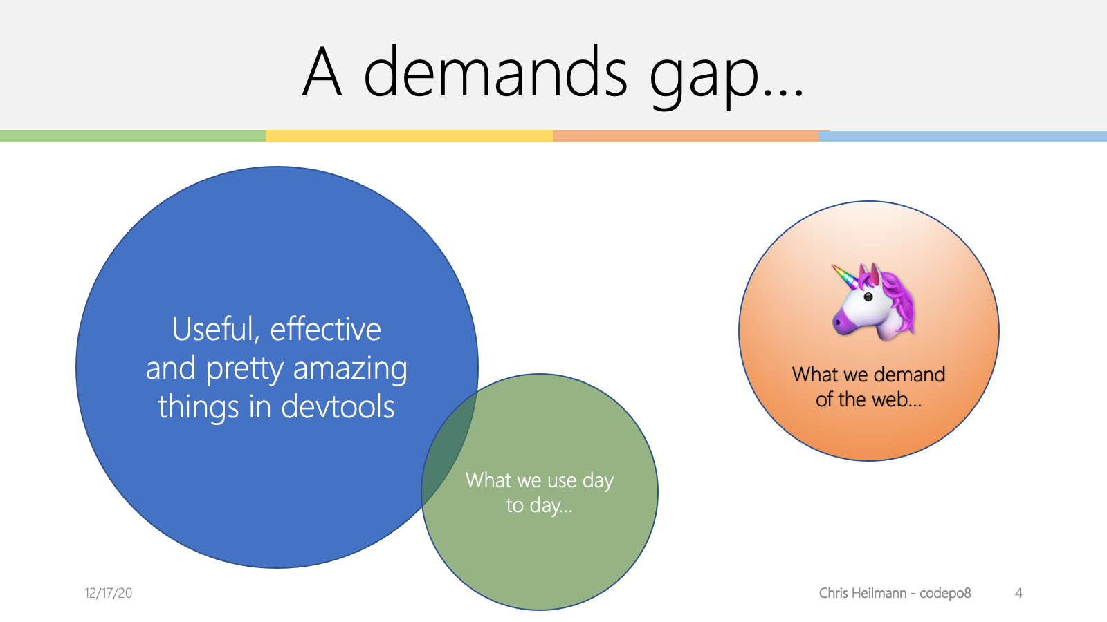
Thus you need to find a single sentence or even a word, a picture, a screenshot, some graph or some illustration that explains and accentuates what you want to talk about in this segment of your presentation. You don't overwhelm the audience with things to read and look at but enable them to concentrate on you. You free yourself in your delivery and – if needed – alter your delivery style to stop the audience from nodding off or leaving.
Let's have a quick example from a long time ago. The following information is what I had in my notes:
The way to have fun with the web of data is to distribute ourselves around the web and bring the data back to our sites.
The first step is to spread our content on the web:
- upload photos to Flickr
- bookmark and tag URLs at Delicious (that was long ago)
- write short and succinct news updates at Twitter
- upload videos to YouTube
- link addresses and set up driving instructions with Google Maps
- update CVs and bios at XING or LinkedIn
The benefits of this approach are the following:
- The data is distributed over multiple servers – even if your own web site is offline (for example for maintenance) the data lives on.
- You reach users and tap into communities that would never have ended up on your web site.
- You get tags and comments about your content from these sites. These can become keywords and guidelines for you to write relevant copy on your main site in the future. You know what people want to hear about rather than guessing it.
- Comments on these sites also mean you start a channel of communication with users of the web that happens naturally instead of sending them to a complex contact form.
- You don’t need to worry about converting image or video materials into web formats – the sites that were built exactly for that purpose automatically do that for you.
- You allow other people to embed your content into their products and can thus piggy-back on their success and integrity.
The two slides that went with the information above where the following:
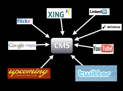

Instead of telling all of these things, I gave people a visual, using the logos of the companies as something they already know and showing with a few arrows what I want to bring across. I was able to talk through the services one by one and say what people can do with them. The second slide then showed the benefit of piggy-backing on the integrity of these services. Add a practical example of what can be done with this approach and you have yourself a great segment of a talk.
Warning: As you can see in this example, spreading your information on the web can become a relatively short-lived experience. A lot of these services are now defunct whilst my blog still loves on. One important bit to remember when it comes to your presence on the web is to always keep a local copy of your content you could import into a new service in the future. Also, if any service you use doesn’t give you options to export your own data, that’s a warning sign.
Use and find images
Images can be a great way of getting a message across. You've probably seen beautiful presentations with inspiring pictures of swooping eagles and calm waterfalls but this is becoming cliché really fast.
I use images for two reasons: to have something unexpected and fun (yes, mostly kittens) in my slides or to connect to a real life scenario.
Example: When giving a security talk instead of showing a web site with a security flaw I show a lock that has been picked, or a badly locking door, or something similar that bridges the gap between a hard to grasp concept and something that is obviously a problem or a bad solution. If I talk about badly implemented accessibility I don't show ugly web sites but a wheelchair ramp with a step in it or a wheelchair accessible toilet behind a door that is too narrow.
Use imagery to illustrate your point, not to "make it pretty". Pretty imagery might be more distracting than helping and for making it pretty you got colours and typography.
Finding images to use these days is easy. There are various resources that offer free to use imagery and frankly most phones have good enough cameras that you could take the photo yourself. Don’t get beat up on having to have the perfect shot when a good enough one does the trick. Slides are there to aid your presentation. They are wallpaper to your performance.
Example: Say, for example, you want the photo of a lock, check this search link. Each of these photos you can use in your slides and all you have to do is to thank the original photographer by mentioning them by name. I normally include the URL of the photo on Flickr in the slide, too, so that other people can re-use the photo if they want to.
No need for expensive stock photography of multi-ethnic people in suits high-fiving or shaking hands – tap into and participate in Creative Commons and we all have more interesting slides.
Warning: Make sure that you really have the right to use the image. Whilst it is unlikely that you’ll get sued for using a photo in your talks there have been instances of people using seemingly “free” resources that ripped of artists. You want to get paid for your work, too. So make sure that where you found the image is also where it originated.
Screenshots are amazingly powerful. Instead of pointing out a resource on the web your audience can check later, make a screenshot of the web site and overlay the URL on the slide. That way people have a visual idea of what the resource looks like and get a much stronger "Oh I remember this" moment when they visit it. The same applies to interfaces of systems – if you show and explain you reach more people than when you just explain.
Tip: Most operating systems have a built-in editor to add annotations to an image like arrows, highlight parts of them or add some text. Make sure to repeat these additions in the alternative description, too.
About code examples
Code examples are what a lot of presenters spend far too much time on getting right. You want a good mix of readability and at the same time make it easy for you to change the code. Presentation software by default is not meant for code display. There is no monospace setting, quotes get replaced by "smart" quotes, indentation is all wrong, you have less space than in your code editor and many other problems.
Code examples, however, are important as they show people how they can immediately use what you are talking about and you bring the topic you cover into an area where they feel home. Showing a few lines of code and what they do in a browser is much more powerful than talking about the amazing features of the product you talk about. It comes back to the "what is in it for me?" that you should always try to answer with your advocacy.
Here's what I do: I write the code in my normal editor, bump up the font size a bit and then take screenshots. This has a few benefits:
- I have colour coding which increases readability and helps understanding the code.
- I have the right font and code layout and none of the "magic quotes" annoyances.
- I maintain the code in one spot and a code change means simply having to create another screen shot.
Provide live demos and downloadable source packages of your code as explained in the “Write excellent code examples” chapter and everybody wins.
Sound and videos
Sound and video are powerful tools for training and illustrating. For example I found that a two minute screencast of some system makes it much easier for people to find their way into it than lots of clever text. You need text anyways cause not everybody can see and hear video. In presentations, however, I find it more distracting and anything else. Yes, it enriches your slides and teleports you into the post 1990 presentation league, but let's face it – it is also terribly interrupting.
As a presenter you normally want to be the person listened to. You also can use your body language to emphasize the message you want to give. From time to time you point out information on your slides but you bring people back to your narration. If you use music or video in a presentation you create a pause as all the senses of the audience are busy following what is going on on the screen. It also creates some time in your presentation where you are part of the audience as you turn and watch the screen (facing the audience while they watch a video is creepy).
Given the disruptive nature of multimedia elements I try to avoid them whenever I can. They look cool but you'll find soon that they are more hassle than they are worth. For example:
- You expect the AV equipment to be able to show video and have audio for you and your computer (good luck with that one).
- You expect the projector to be able to show video.
- You make your slide deck impossible to distribute unless you turn it into a video.
- You lose the rhythm of your talk, in essence you create a break that you need to pull people out of again.
That doesn't mean you cannot talk about videos and screencasts. I normally upload them to YouTube, take a screenshot of them and show them as a slide together with the YouTube URL (which I can link and also provide in the HTML notes). That way you can talk about the video and don't lose five minutes of your presentation. You can also explain what happens in the video and how it is relevant to what you are talking about. And people who can't see videos still have an idea what is going on.
Tip: An exception here are screencasts, which I am a big fan of. Instead of clicking around an interface and entering live data it makes sense to record a screencast and then talk over it. The distribution problem still happens, but I found a lot less conference set-ups having an issue with soundless video than with real “movies” that need sound.
Example: Another exception to my rule is when you want to provoke an emotional response and make people understand something beyond their own experience that is very human. One example is that when I talked about the accessible version of YouTube I created a long time ago. Rather than me explaining what effect these changes to the interface had it was more powerful to show how Lizzie, a user with learning disabilities and Kirin, a blind user were able to enjoy online video. Especially Kirin's end sentence "The thing is the power … this has given me the power that it should give me in the beginning." is a wonderful emotional moment to get you back into your talk.
If you really feel that you need to use video or audio in your talk then use it at the beginning or the end of it. That way you either come in as a spectator and turn into the presenter or get out on the same level as the audience. In most cases video and audio are extra bells and whistles. And a good talk doesn't need those. This also applies to transitions and effects.
Don't bling it up
A lot of presenters are happy to use every transition and animation the presentation software comes with. But that doesn't make it better – especially when they look bad on a slow computer. Animation rhymes with moderation and this is what you should always keep in mind. You want to make a point with your presentation and not overload the audience with whooshes and blinking shiny things that distract from your content. Use transitions to make your slides smoother, use animation if you want to reveal something bit by bit and avoid having to jump from slide to slide.
Example: I like to use "fade through colour" as the transition effect between my slides which smoothly fades in and out in a second. I only use animation when showing screen shots and showing zoomed smaller parts overlaid or to focus on one part of an interface.
Used correctly, animation can be a very powerful tool to make a step by step process more obvious. If you are not skilled in usability and design though it will most likely appear tacked on and, yes, tacky, as animation has been traditionally used to spice up very boring presentations.
The other issue is that animations can actually work against the flow of your presentation. Sometimes you want to speed things up and if you hard-wired long and complex animations you stand there waiting for your slides to catch up with your narration. Sometimes you also have AV equipment that cannot show animations and that makes you wait for something that never happens.
Example: When I was in once at a university my talk was streamed on a video service of the university which meant the streaming server had to remotely connect into my laptop. As everything is wonky over VPN neither the animations nor the transitions worked.
Keep it brief
Keep your talks brief and if possible cover one topic. If you need to cover more than one make sure that you have a good narration flow from one to the other to avoid them appearing stitched together. Presentations should bring home one message and that one well. This could consist of several sections but the overall story should be obvious. Try to give the whole talk one main theme and return to this in each of the sections.
As mentioned earlier, your slides should contain only what is necessary and not more. There is no point in reading from your slides as that would make you a member of the audience and you have a race who can read it faster. I tend to have either only a theme per slide or one sentence and I try to avoid bullet-lists at all costs – especially nested ones. These are old school presentation style and conjure up unpleasant memories of having to sit through two days of boring training sessions.
As mentioned earlier, an agenda up front can be a good idea if you cover a lot of things but it also allows the audience to pick their faves and shut down in between. This probably means they miss important parts of your talk. If you do a good job as a presenter the amount of slides is not a problem and neither is at which stage of the overall talk you are. People will be lead through it without realising it. The overall amount of slides is only limited by your ability to go through them quickly. My rough estimate is a slide a minute but I am also a very fast speaker.
Consider the audience
One instance where I break my own rules of brevity is when the audience consists of people who do not speak my language natively and might have a harder time keeping up with my pace and accent. When dealing with an audience like this, having a simple sentence per slide or even some bullet points and repeating them has quite an impact.
- You keep things much more simple and thus you don't make the audience feel inadequate or that they are missing important things.
- You are forced to pace yourself which is very important with an audience like that anyways.
- You allow for better translation in case you get transcribed afterwards or have live translation at the conference.
In these scenarios I also tend to keep my slides much more technical. Code is international and people can repeat it and write essays about it in their own languages.
Another thing to remember when giving presentations in different cultures is that pop references and puns do not work. Don't expect the audience to know what you know and to be excited about what you are excited about.
Example: When I went to Sweden to give a talk I put in some slides about the Swedish Chef from the Muppet Show (here in my favourite sketch of all time – "Chocolate Moose"). Nobody got it as the chef is obviously not called Swedish in the Swedish version of the show. I also added a "have a break, have a Kit-Kat" joke in there, and this was another ad only aired in the UK. I only knew it from "world's funniest TV ads" on German TV. Either reference landed like a lead balloon and didn’t add to the talk at all.
As stated at the beginning, a lot of the tips here are for creating presentations for developer crowds. If you speak mostly to designers, PMs or management, other tactics have to be applied. All in all it is a good idea to question the classic way of presenting and slide design though.
Corporate and conference templates
During your job as a developer advocate you will be asked to use conference or corporate slide templates. Try to avoid doing that. The reason is that these templates are almost all the time targeted to the classic presentation style of one heading and dozens of nested bullet points followed by a copyright line nobody cares about and other legalese.
The reason is that using a corporate or conference template is good for the conference and the company but distracts you as a presenter – it is just not you. You and only you should own and run the presentation as it is your integrity on the line. Once a conference or company asked you to be a speaker for them they already trust you to do things right and there is no need to keep the corporate hat on and do a song and dance.
That said, there is a benefit to using these templates. In the corporate case you show a consistent look and feel to the world and align yourself with other publications. The question is if you want that. In my case, not looking like the slide decks of my company battles a lot of prejudices developers have as developers do not trust big brands. This is for you to decide. In the case of a conference looking the same as the others makes your deck more findable later on but at the price of looking the same as everybody else and having a distracting logo on each slide.
The solution is to meet half way. If you make the first page of your deck align with the others and then switch to your own style everybody wins. The cover sheet of your deck is only important in two cases:
- To fill the screen until your talk starts
- As an eye-catcher when you later on send out the deck and show it in a blog post.
- As a preview of the video recording of the talk
Other than that the slides should take the backseat and aid your presentation.
Don't reuse without personalising
Another very common thing that will happen to you once you become a speaker for your organisation is that you will be handed presentation decks to present. "This has been done by Stephen from the US office and has been signed off by PR. Stephen can't come to the conference, so we want you to fill in for him. Here are his slides, good luck." is something you will hear a lot.
If that happens to you, be firm and say that this is not how it works. You are a presenter – not a parrot. If the slides are not in your language, mirror your approach to a certain topic or talk about technology or products you are not firm in or have no control over you are treading on very thin ice. It is you on the line as the speaker and the success of your talk stands and falls with how you come across. If you can't be you, then don't do it.
That said, nothing stops you from using the information on the slide deck and translating it to your "language". Instead of flat out refusing to use the deck say that you are happy to take over and use the information but that you want to have a chat and information hand-over from the original author. Every speaker has extra information that makes slides make more sense and become more appealing and you cannot guess these things – you need to hear them "from the horse's mouth".
It boils down to this: giving the talk is one half of the whole show. You will have to answer questions and you will have to be able to explain the practical implementation of a certain technology or product. This you can only do when you played with it yourself and verified your findings with an expert.
Slide decks that get re-used without being challenged and changed become stale. For a company it makes more sense to keep a repository of facts and ways to explain a certain product than full slide decks. That way your information doesn't become stale.
Share and enjoy
Once you're done with your slides and you are happy with them, don't forget that sharing is caring.
This could happen internally and externally. Sharing your decks in the company in a remix-able format is a great way to inform your company of your work and allows people to re-use your approach to explaining different products. It is great training material for other people in the company who are interested in presenting more or plan to become developer advocates themselves.
Upload the deck to your blog, make it available as a download or – even better – upload it to a slide sharing resource. There are various great tools to get your slides distributed. People can comment on them, share them with friends, embed your slides in conference blog posts or as a resource for a certain subject and many things more. They are what Flickr was to photos and YouTube is to videos.
Sharing your slides is what a lot of people in the audience will ask you to do and it will get you known as a speaker. People may stumble upon your decks somewhere else and learn about you that way.
Additional presentation tips
The following are some tips that worked very well in the past for me. As you are not me, you might want to tweak them a bit. So here's what I do when I give presentations.
Introduce yourself
Introducing yourself – however briefly – breaks down an initial barrier. You are not any longer this unreachable person on stage or at the head of the table – you are a normal person. Explain why you are competent to talk about the matter at hand. Even better, explain how you got to pick this topic and why you want to talk about it. Then put the ego away – people came for information, not to see you sing and dance.
Use humour
Humour is important to keep a long presentation interesting. I like to put in things that people just don’t expect – to keep both me and them on the ball. Humour also makes things more approachable. We tend to use humour to deal with things that scare us. Furthermore humour allows for a memorable moment – it is a way of structuring and providing landmarks in your presentation. That said, be careful though.
Edgy humour may work for stand-up comedians, but quoting their material can get you in big trouble. If you use humour, make sure you don’t offend people. What you sometimes see as a funny way to describe something can be immensely offensive to people who suffer from a certain disorder or had terrible experiences. The best way is to ask a few people not like you what they think of the joke and if it adds some levity or fun. Also remember that not all humour translates to other cultures and languages.
Build bridges to the real world
I like to bring up real world examples and comparisons. The rationale is that they make theoretical and hard to grasp data more easy to consume for humans. Real world comparisons also allow for emotion – and emotional responses are powerful and make us remember.
Example: If you talk about code standards and re-use of code without a proper review, a good case to mention is the Ariane 5 disaster. This rocket self-destructed because it veered off its intended path 37 seconds after lift-off. The reason was re-use of the code used to launch Ariane 4, which had different flight specs. 370 million dollars were lost due to this error.
Pace yourself
Speaking at the right pace makes you easy to understand. If you appear rushed listeners will feel uneasy. Trying to keep up is a terrible feeling and makes us feel inadequate. So speak slowly with meaning and concentrate on pronouncing things thoroughly. Pauses are good. They allow listeners to take information in and digest it in the way they know best.
Tip: This is of utmost importance when your talk is being live transcribed, or translated into other languages or sign language. In this case it is also important to have a list of special terms that should not get translated as a handout for the translators.
Avoid “Hello World”
“Hello World” examples are easy to show. They are also useless, as they teach a syntax, but not the concept of a language or solution. There is no personal value in “Hello World”. We should teach how to solve issues and fulfill tasks. I yet have to be asked in a professional product to produce “Hello World”.
It is much better to have a real production example to build upon:
- “This is what we had to create – here are the specs”
- “This is the final outcome”
- “Here’s what we used to deliver this job”
- “... and here is how you can do it yourself!”
Write for what people are asked to do, not what you expect them to do for you.
Be fresh
I always try to deliver fresh material. I hate re-using presentations and training material. The least I do is to bring some new, fresh angle. Check what is hot at the moment, research it and add it to the talk. That way you show that your content is not only good but also relevant at this moment in time. It also means for seasoned conference attendees that you don't bore them with something you told them before. Seasoned conference attendees are also adamant bloggers and Twitter users – so this can only be a good thing.